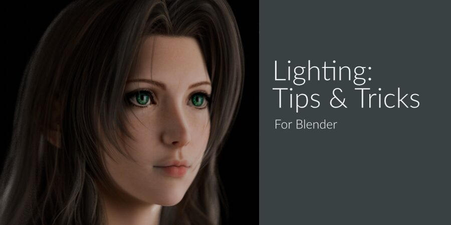
Today we are going to take a look at some tips to hopefully improve your lighting when working on your scenes in Blender.
The general concept of these tips can easily be used in any 3D application but any options or settings will be focused on Blender. I’ll also not be using any Add-ons as while they can be extremely helpful I believe it is important to understand how to create lighting setups without any external help from add-ons.
IMPORTANT
Good lighting is usually subjective, however there are some lighting setups that are generally seen as undesireable outside of very specific situations. Apply these tips as needed and remember that it’s okay to ‘break’ rules or use ‘undesireable’ lighting if it improves your work.
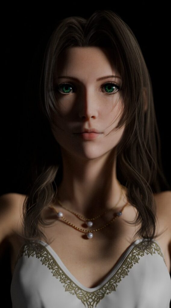
Avoid: Flat Lighting
Flat lighting is usually something to be universally avoided assuming you aren’t taking a mug shot or a passport photo.
This is something you usually want to avoid. The light is removing most if not all of the shadows, it is far too bright and flat.
Taken from the front, the issue becomes even more prominent.
The lighting is far too bland and boring, there are barely any shadows or areas of contrast to produce any interest.
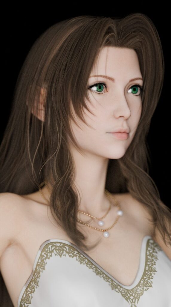
Do: Practice Photographic Lighting Techniques
Something that can help a lot is to practice lighting characters in a ‘void’, a file with nothing but your character. Practice using what? Well, assuming you are using Cycles, actual lighting setups used by photographers.
For example classic lighting setups like Rembrandt lighting, or 3-point lighting. Now. If you read that and shouted “But that’s what they all say and you can’t just throw 3-point lighting into your complex scene and expect it to work!” then you’d be right.
The idea isn’t (always) to be able to throw lights in a scene and have it look amazing. The idea is to look at what the lighting does in the context of just the character. Why is it desireable? What makes it look nice? Why are the lights positioned the way they are? That way you can reproduce similar shadows, contrast and positioning when you light in your scene.
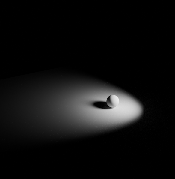
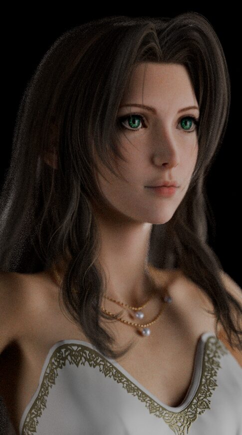
For reference here is my scene setup for producing the Rembrandt style lighting with Aerith.
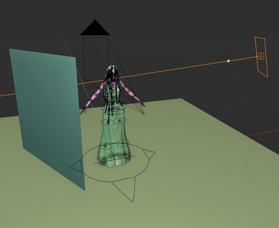
The plane of the left is just using a white material with a high roughness value to use as a light reflector.
INFO
Rembrandt lighting, for those who don’t know, is a portrait lighting setup that reproduces lighting in the way Rembrandt used in their paintings. It is generally known for the triangle of light produced on the shadowed cheek of the subject.
Do: Adjust the Spread
Area Lights are arguably the most used and most useful of the lights in Blender. Outside of specific use cases you will likely find yourself reaching for them 99% of the time. However you can get much better lighting from them by changing the default spread.
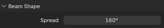
I’ve noticed this setting is either ignored quite a lot or just not mentioned by most tutorials but it can help dramatically with your scenes lighting.
Spread is actually quite a simple setting, it changes the angle light is allowed to spread from the light source. Most real world lights do not have a spread of 180 degrees so I always advise reducing it.
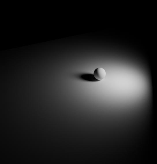
Area lights with 180 degree spread can still be great for adding soft ambient light, but lighting your whole scene with them can be difficult without causing your scene to feel flat. Reducing the spread focuses the light and helps emulate softboxes, windows and other real world lighting sources.
Do: Use Images via Nodes
An interesting way to help produce more realistic light falloff (or produce Gobo effects) is to use images with your lights. Simply open up the material editor while you have a light selected and tick ‘use nodes’.
I believe using UV coordinates for lights was only added fairly recently, so make sure to use an up-to-date version of Blender if you want to try this out.
Here is the node setup I used to make a procedural gradient to emulate the falloff of light in a softbox. You can, of course, just throw an image in there if you like.
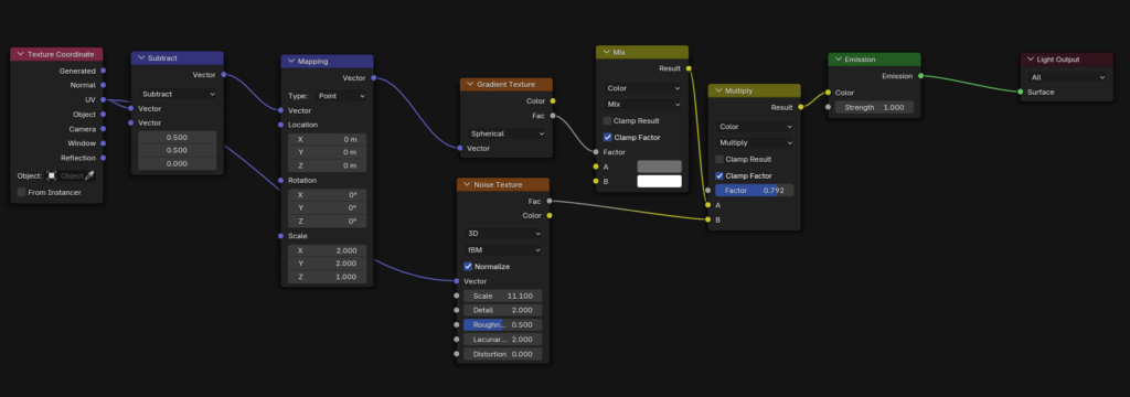
Using an image with a pattern, such as leaves or a window frame, can be used to create a Gobo. A Gobo, in lighting at least, is just a stencil that blocks light in a specific pattern. You can use them to make it appear as if the light is being filtered by trees, or coming through a window frame.
Do: Use References!
Yes. I know it’s a boring one, but use references. Use them a lot. PureRef is a fantastic free app to use for collecting refrence images.
If you chase realism like myself then your best options for references are Pinterest, Google/Bing image search and 500px.
Do: Practice, Practice, Practice!
My final tip is to practice. I know it sounds obvious but this is honestly the best way to learn. The key part though is to analyse your past works to see what you could improve. It’s also a great idea to have other creators critique your work, as much as it sucks to hear all the things you need to improve, it really does help a huge amount.
The Takeaway
Unfortunately there is no ‘cheat’ for good lighting and in general it can be seen as subjective. However ‘good’ lighting usually enhances the image in a few ways. It can lead the viewer to a focal point, help enhance the mood of an image through color or temperature, create shapes or define form using shadows, or even just enhance realism by feeling natural.
I realize this post is a little random, and I considered not publishing it, but hopefully something in here helps even a little bit. Also don’t get discouraged when lighting, if you feel like nothing is working try taking a break and coming back with fresh eyes.
Be First to Comment