If you have been a member of my Patreon at any time you might know that I have a slight obsession with chasing realism in my renders. Especially so when it comes to skin shaders.
With that in mind I thought I would make a small article that looks at, what I believe, are the components that contribute to realistic looking skin without creating too much node spaghetti!
IMPORTANT!
I am in no way an expert. I do not have any production experience. I am simply a 3D artist mostly known for making NSFW content that has spent far too much time aimlessly trying to make a good skin shader that works well and isn’t mind numbingly complex!
Throughout this article I’ll be showing some examples to help illustrate what each component brings to the shader.
This look at the different textures that can be used in shading skin is quite long so please use the table of contents below if you want to hop to a specific section.
Good Quality Diffuse Textures!
This might seem obvious but the unavoidable truth is that a good quality diffuse texture will contribute a lot to realism. What is good quality? Well, that depends on your goal.
Above is an example of a relatively realistic diffuse texture. It is 4096 pixels by 4096 pixels and a cleaned and slightly modified version of Aerith’s skin textures from Final Fantasy 7 Remake. The art style in FF7 is slightly stylized and so they are not fully realistic in this case.
The above is just the diffuse skin texture, there are no other maps active nor is it a full shading setup it is simply passed through a Principled BSDF.
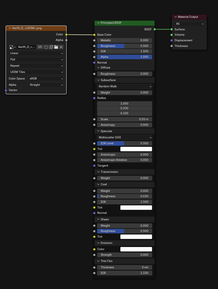
This is to show a baseline, just the skin texture and a basic default Principled BSDF, from here we will build our shader.
Where to find Textures?
If you are not limited by your subject as I am, for example needing to use a character’s in-game textures to maintain an authentic look, then there are a few good places to look for skin textures:
- Genesis 8 and 9 characters from Daz 3D are excellent and affordable.
- Merchant packs from Daz 3D are also excellent and affordable.
- If you have the budget Texturing XYZ have some of the best skin textures available.
- 3D.sk have a great range of images that can be used to create your own skin textures.
How to adapt your UVs to use pre-made skin textures or how to paint your own is way outside my expertise and outside of the scope of this tutorial, but hopefully those resources help get you started if that’s the direction you’d like to take.
Specularity
Next let’s take a look at the importance of specularity in a skin shader.
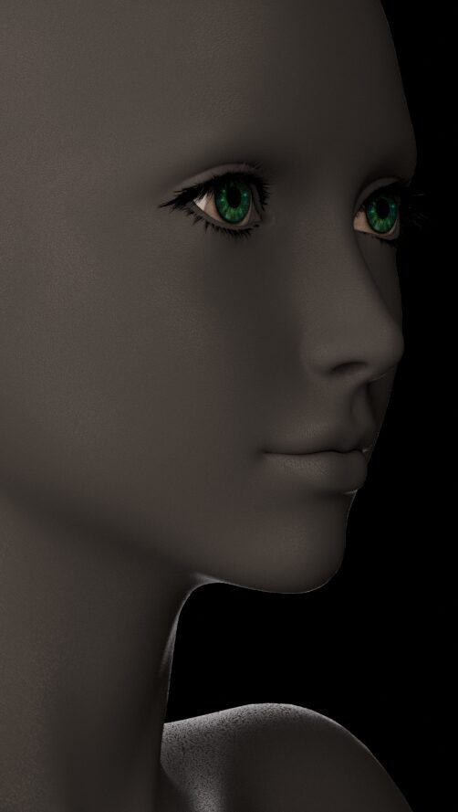
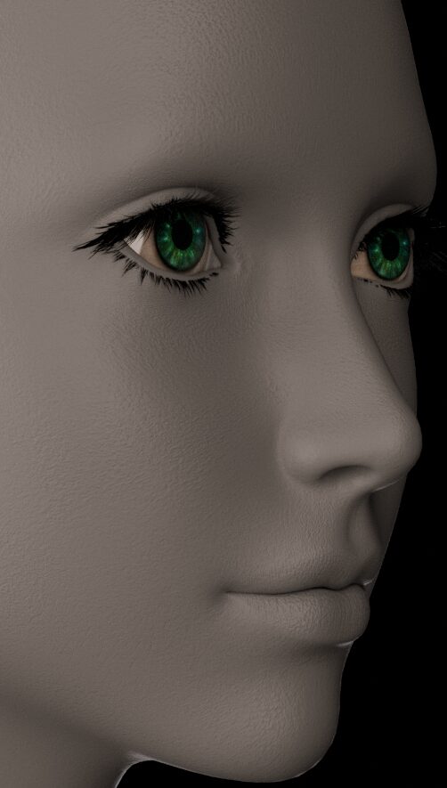
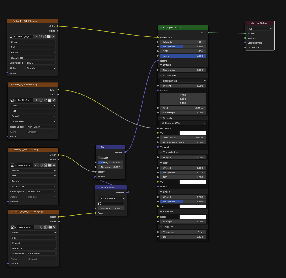
The above shows the effect of just Aerith’s specular texture which is based on her original mixed with a Daz3D specular texture for Genesis 8. I used a slightly dark grey as a base color to show the details it produces. This is simply plugged into the IOR level pin.
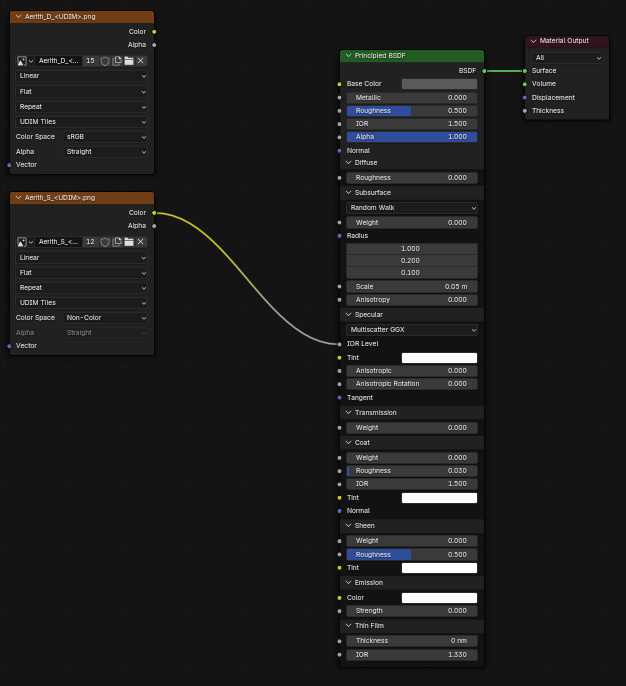
I have seen some discussion as to if it should instead be used as the Specular tint, but I believe that should be left free for other uses and I prefer the effect given when using the IOR Level.
The specular map is generally quite dark as it reduces the specularity of the skin to prevent unnaturally sharp highlights.
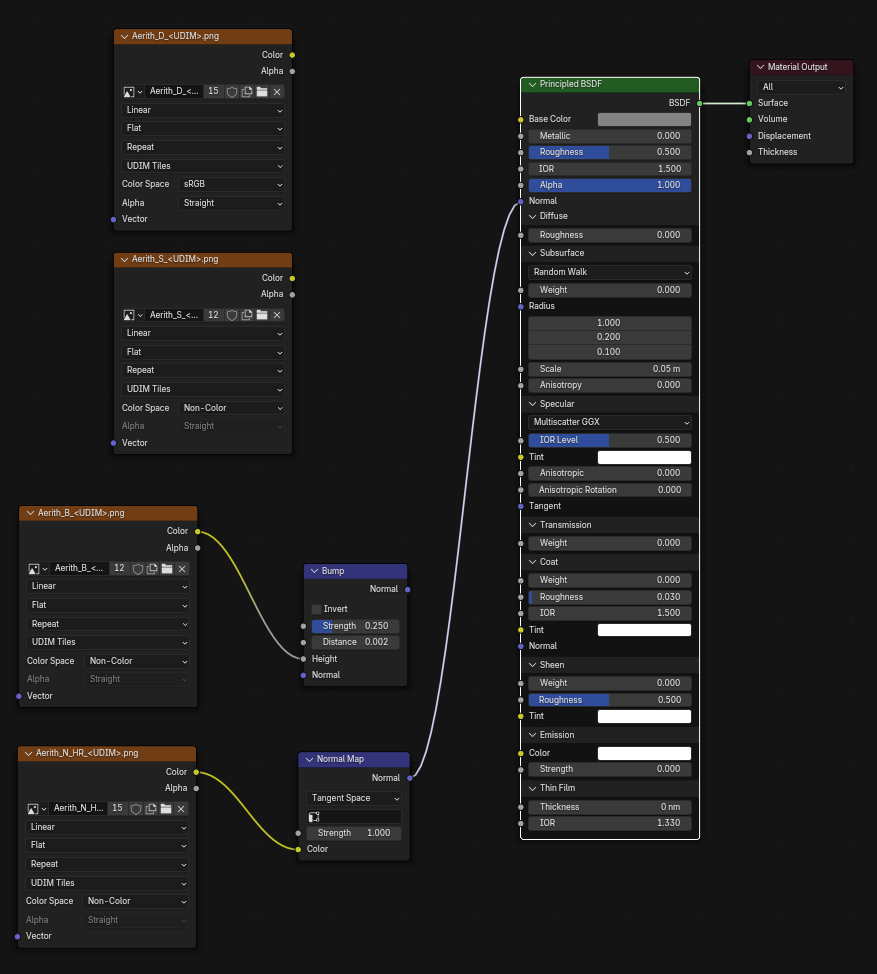
Bump, Normal and Displacement
All three of these can be used to enhance realism by adding texture to the skin, but it is very easy to create an unnatural look by making the details provided by them too strong.
DID YOU KNOW!
Bump and Normal are both ‘fake’ detail while Displacement deforms the actual geometry. Bump and Normals are like an artist painting shadows and highlights to create the illusion of depth. Displacement is more like sculpting, pushing and pulling geometry around to create different shapes.
Bump Textures
Bump is usually used for high frequency details such as pores and detailed skin texture and imperfections.
It’s very important not to overdo the bump. I like to use a ‘clay’ material to find a value I like as shown above and then tweak the values further once I have the other textures enabled.
As you can see the values for the bump node will generally be quite low. As I said we will be revisiting these values later as enabling other features can change how visible the bump’s effect is.
Normal Textures
Normal textures are generally used for medium sized details. Think larger skin details like creases and pits, bumps, tendons etc.
Above you can see a ‘clay’ render with just the normal map active. Compared to the bump map it focuses on larger skin details especially noticable on the lips where it takes care of the larger creases.
The normal strength is usually 1, but it’s important to note there is no rule that it has to be set to 1, reduce it or increase it if you need to!
Displacement Textures
As mentioned previously Displacement is unique in that it actually moves geometry and requires that you have a dense enough mesh for it to work effectively.
Assuming you have a high enough quality texture displacement CAN be used for any kind of detail. Want your character’s pores to be actual displaced geometry? Go for it! The question is more is it appropriate for your scene? Can you afford to have the amount of geometry needed for that and it’s effects on your render times? That is something only you can answer.

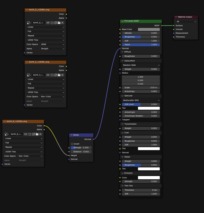
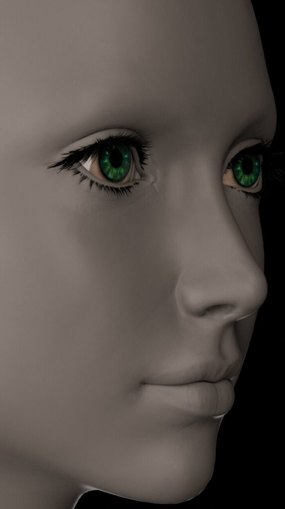
Above you can see the displacement I use. This is somewhat similar to the normal texture but with slightly more detail. I will adjust the strength and use this instead of the normal texture if I am doing a close-up that requires that level of detail. My displacement map is an 8K 16-bit PNG, however they really do benefit from the highest quality possible so a 32-bit EXR file would not at all be overkill.
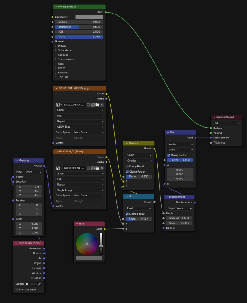
Above you can see my setup for when I do use displacement. It combines a general displacement map with a repeated Micro Pore texture for a little extra detail.
I’ve seen it repeated often that Displacement is for large scale details, but it is important to remember as your view gets closer to your subject those ‘small’ details quickly become ‘large’ details from the perspective of the camera!
Combining Textures
After all that it’s time to combine our textures with a Principled BSDF node and see how they look.
As you can see, it’s not too bad even with just a Principled BSDF node at default settings.
It doesn’t feel quite right though. It doesn’t feel skin like, flesh like. It doesn’t feel alive!
So how do we fix that? Well a huge part of skin looking flesh like is Subsurface Scattering or SSS. Let’s add that and see how it looks!
I personally think that looks a lot better! Aerith’s skin looks softer and warmer, you can also see that adding SSS has also softened the bump making it look a lot less harsh. Due to this you may want to increase the strength but I’m happy with this for now.
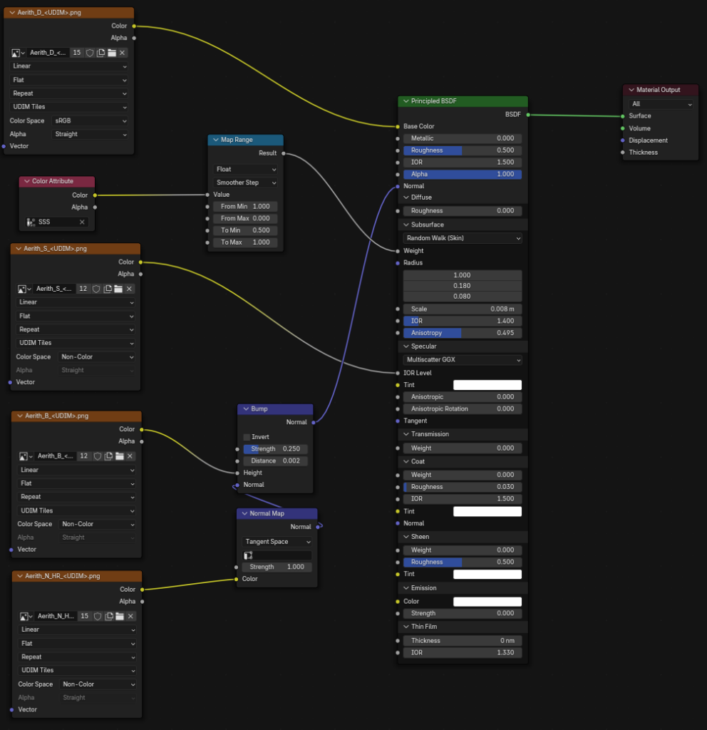
You can see here that I have a Color Attribute node running through a Map Range node. I have used vertex paint to paint around the eyes, although you could use a texture if you’d like.
SSS color attribute painted around the eyes using vertex paint!This is used to half the strength of the Subsurface Scattering around the eyes as it produces an green hue around them due to the geometry being in close proximity to the eyeball. I’m sure there are other fixes but this is a very quick and simple one.
Subsurface Scattering Values
You may be saying: “That’s all great, but how did you arrive at those values for your Subsurface scattering?”
The answer is trail, error and a bit of research. Let’s take a look at the values.
Weight: The weight is just how strong the SSS effect should be. In pretty much all cases, it should be 1. It is not a hard rule and as I’ve shown you can break it to deal with areas that pose issues to lower the strength.
Radius: The radius can cause a lot of confusion. It is presented as a vector, and it essentially is a vector. It represents the distance light will travel through the surface for the Red, Green and Blue light respectively. So 1, 0.18, 0.08 is 1 meter, 0.18 meters and 0.08 meters.
Scale: This is a multiplier for the radius. So you end up with Radius * Scale to get your true scattering values. In my case 8mm, 1.4mm and 0.64mm. Despite my model being around real world scale these values are quite high as the generally recognised real distance is 0.5mm to 0.1mm for human skin.
IOR: I leave this at the default of 1.4 as it is generally recognised as a good all round value for human skin.
Anisotropy: Between 0.4 and 0.8 seems to be a good value for this. It essentially controls how ‘deep’ light penetrates into the surface. Use this to intensify the soft glow-y skin look while preventing loss of detail from your bump or normal maps caused by just increasing the radius or scale.
Dealing with Roughness – Adding Dual Lobe-esque Specularity
That’s right, we still aren’t done! It’s time to deal with roughness. It is entirely reasonable to leave the roughness at the default value since we are using a Specularity texture, but I’ve noticed doing a little tweaking can get a bit more out of our shader without too much effort.
Dual Lobe Specularity is the concept that a material can have two distinct roughness values, or ‘lobes’. In the case of skin we have a shiny, sharp reflection from skin oils and a softer, diffuse reflection from other parts.
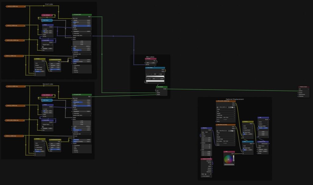
We can simulate this to some extent simply by making a copy of our Principled BSDF and all of the textures and mixing them together with a Mix Shader.
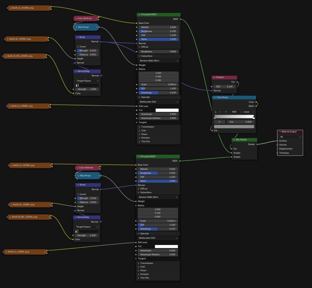
This is essentially just the same Principled BSDF setup twice mixed together using a Fresnel node set to 1.4 IOR. The Color Ramphas the first stop set to 0.2 (RGB) and the last stop to 0.9 (RGB) so it will always use a mix of both.
The only difference between these is the roughness value. The first is 0.2, the second 0.5. One great thing is that you can experiment, adding clearcoat to the second lobe can give a very convincing sweaty or oily skin effect.

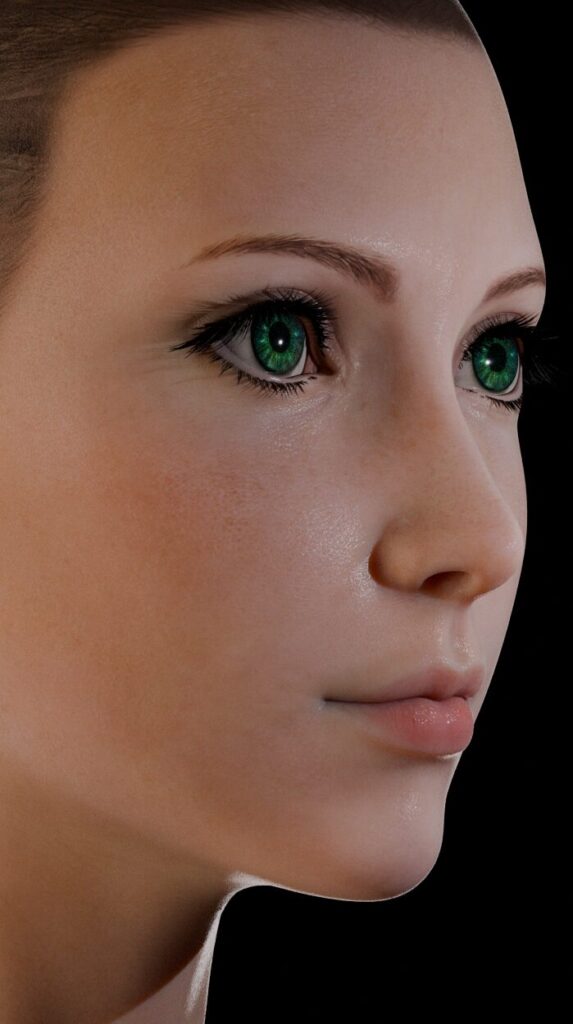
I’ve added an extra harsh light in these two example images and you can see this change adds some interesting highlights and brings out the skin texture much more in the image on the right.
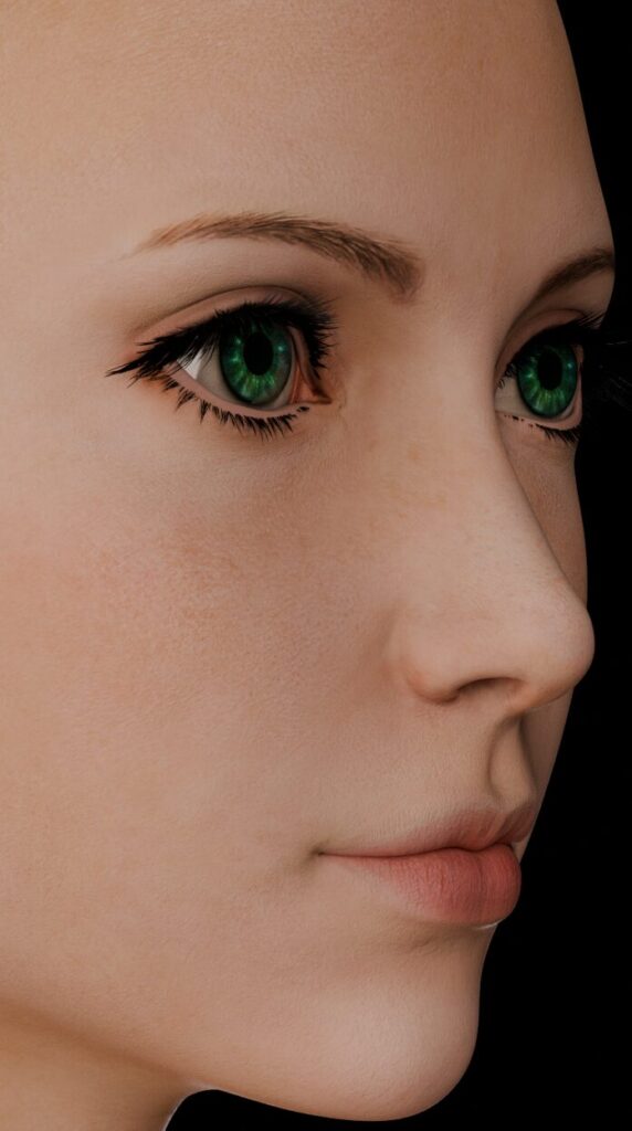
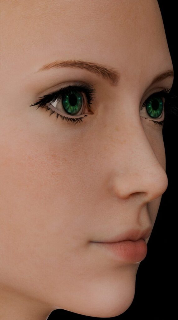
The Final Skin Shader!
We are finally at the end. There are, I’m certain, even more tweaks that can be done and you can bet I will be continuing to play around. That being said let’s take a look at what it looks like when you put everything I’ve explained together.
The final node setup looks is surprisingly simple. I’ve tried much more complicated versions instead of using the Principled BSDF and I didn’t see enough of an improvement to deal with the added complexity.
You may notice I have added a couple more tweaks such as using a lightened version of the skin texture as the specular tint to color the highlights a small amount, and added some anisotropy to stretch out the reflections slightly.
These tweaks are just something I preferred the look of, feel free to steal them if you’d like.
If you managed to read through this entire thing, thank you! I realize there is a lot of information here and maybe none of it is useful, but I wanted to at least write down some of the things I’ve learned while working on trying to make skin look it’s best in the hope it can actually help others.
If you have any questions or comments let me know and I’ll try my best to answer them. You can get in touch via the comments below (it may get held for moderation as I get a lot of spam) or if you’d prefer a more private answer you can ask me on Twitter @NabesakaRenders but do note my account is very very NSFW!
Be First to Comment